Skip to Main Content
_
Sensor Network
Maps & Radar
Severe Weather
News & Blogs
Mobile Apps
More
Search
close
gps_fixed
gps_fixed
Find Nearest Station
Manage Favorite Cities
Log In
Go Ad Free
account_box
Log in
Go Ad Free
settings
Settings
Sensor Network
Maps & Radar
Severe Weather
News & Blogs
Mobile Apps
Historical Weather
star
Current Weather for
Popular
Cities
San Francisco, CA
52
°
F
Clear
Manhattan, NY
54
°
F
Clear
Schiller Park, IL (60176)
warning
53
°
F
Fair
Boston, MA
51
°
F
Fair
Houston, TX
73
°
F
Cloudy
St James's, England, United Kingdom
50
°
F
Partly Cloudy
Search
close
gps_fixed
gps_fixed
Find Nearest Station
Manage Favorite Cities
settings
--
Feels like
--
--
--
/
--
--
--
--
--
--
--
--
--
--
12AM
6AM
NOON
6PM
12AM
Apr 16
+0000
Apr 17
Full Forecast
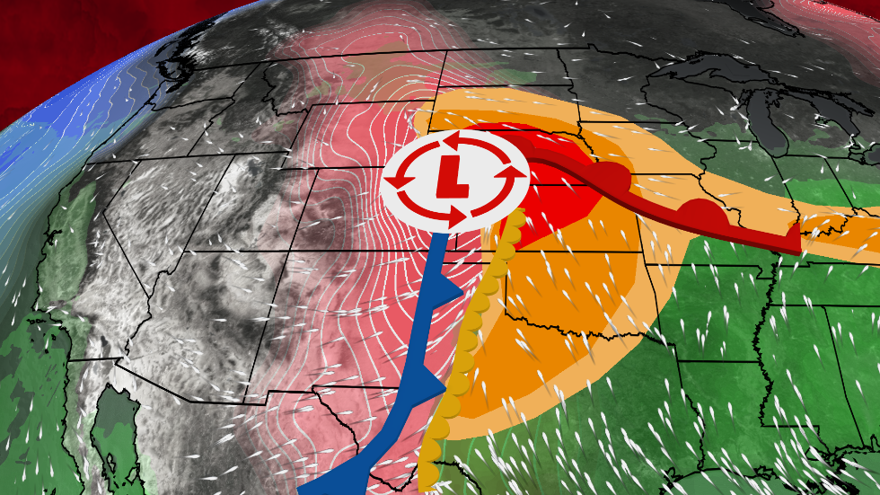
Plains, Midwest On Alert For Hail And Tornadoes
We've had a lot of severe weather lately. Here's what we are most concerned about with this next setup.
Plains, Midwest On Alert For Hail And Tornadoes
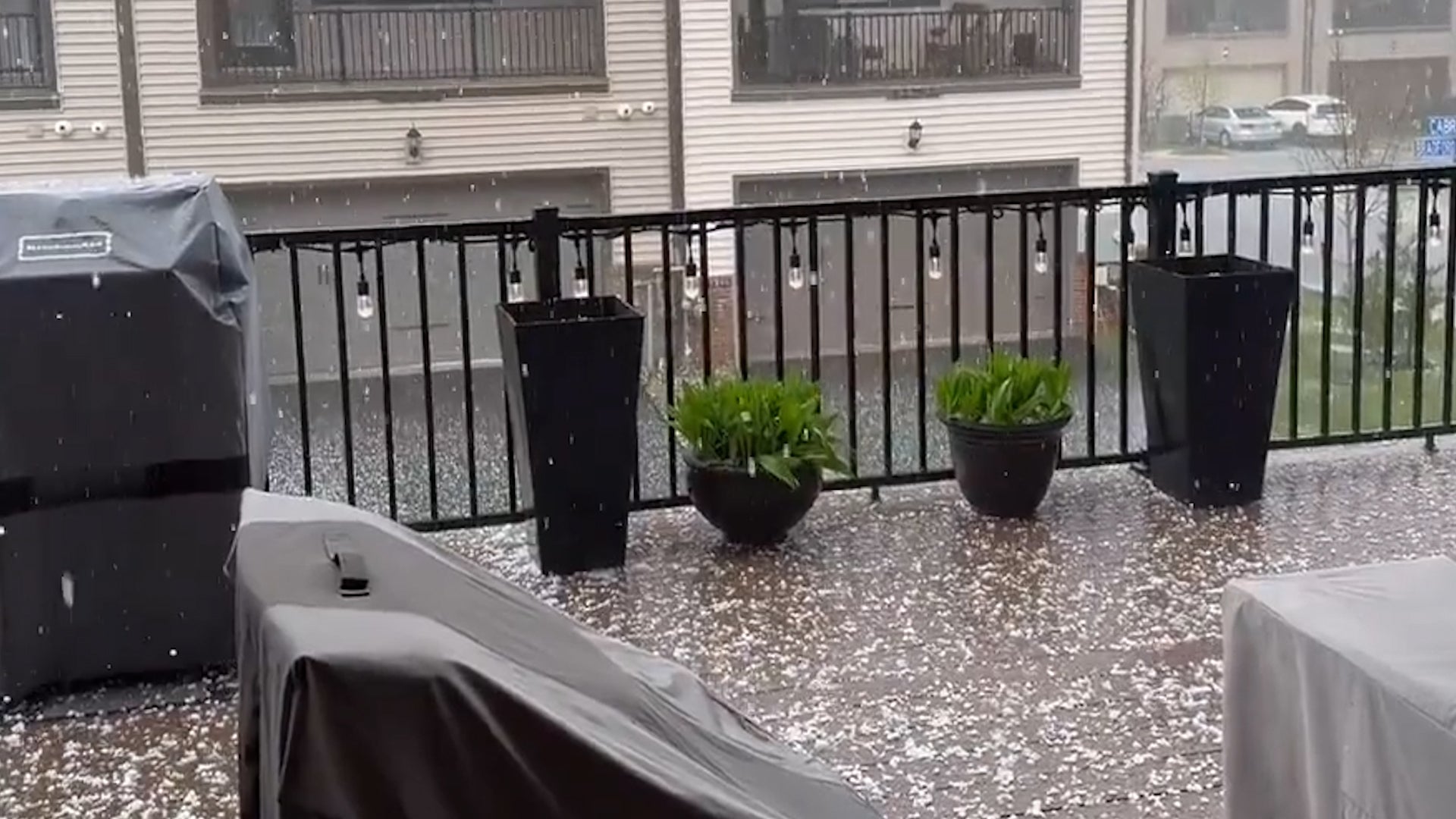
Hailstorms Pound Washington Suburbs
Severe thunderstorms including hailstorms made for a messy Monday in the Washington, D.C., area.
Hailstorms Pound Washington Suburbs
See When Big Chill Replaces Summer Temperatures
Chilly conditions return this week as a cold front marches eastward ending the more summery temperatures.
See When Big Chill Replaces Summer Temperatures
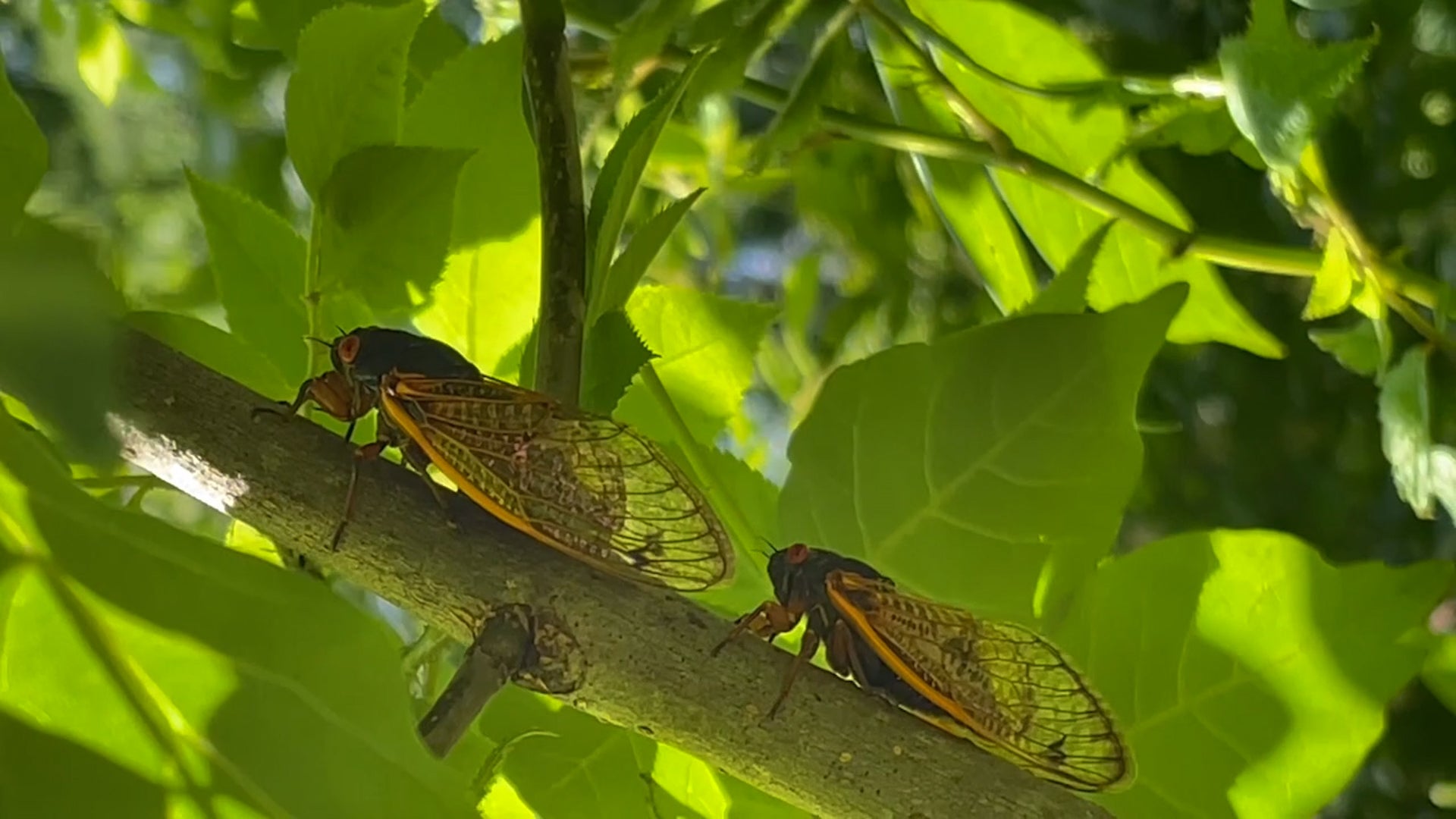
Event Like This Hasn't Happened In 200+ Years
Trillions of cicadas will emerge in May in the Midwest and Southeast, in a double-brood event that hasn’t happened in more than 200 years.
Event Like This Hasn't Happened In 200+ Years
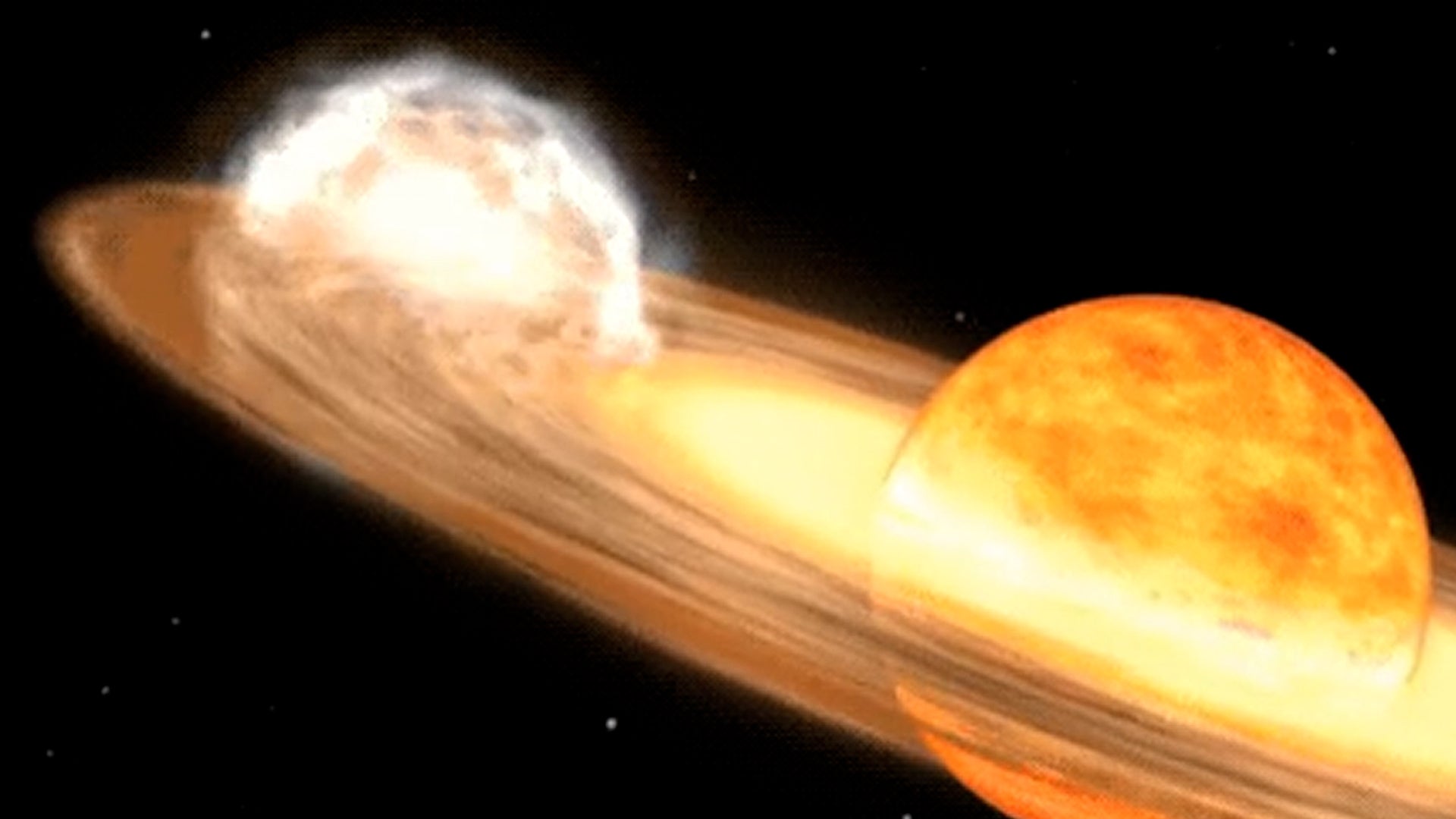
Next Celestial Spectacular Rarer Than Eclipse
Astronomers are buzzing about the next stellar spectacle coming soon to the northern hemisphere.
Next Celestial Spectacular Rarer Than Eclipse
Please enable JavaScript to continue using this application.